Empty
 Desktop
Projects
Empty
Trash
Empty
 readme.txt
Desk
An alternative portfolio that lives on my desk.
Design, 3D and development, 2026

Instead of a list of pages there is a room you can look around: a computer you can zoom into, polaroids you can pick up, a notebook and a phone that still dials.

THE IDEA
A portfolio has to be clear, immediate and to the point. That is often what makes it boring: it shows the work and loses the personality of the person who made it.

So I made a second one that behaves like a place, where the work sits inside the computer, the photos on polaroids and the notes in a notebook.

It is deliberately hard to find your way around, because it is meant to be a game. The serious portfolio is a separate site.

I hid easter eggs that nobody explains how to find. Only a creative and curious visitor will see them all.

MADE IN BLENDER
Every object on the desk is made in Blender: the computer, the phone, the clock and the notebook.

The rest is not in Blender. The polaroids, the time on the clock, the writing on the Post-it and in the notebook, and the page on the screen are drawn live by the browser, on top of the render.

RENDERED AHEAD OF TIME
Nothing on the desk is a real-time model. The scene is rendered in Blender from 23 camera positions, on a transparent background, with a floor that only catches shadows. A script converts the renders for the web.

As the mouse moves, the page moves between the 2 renders closest to it. The browser never computes the light, so the room keeps the shadows of a full render and still follows the cursor.

DRAWING ON A PICTURE
A render is only a picture, so each one is exported with its geometry: where the glass of the screen lies, as a grid of points, and how the camera projects the desk, as a matrix.

With those numbers the browser can draw on exact places of the render. The polaroids can be dragged and piled up, the ink paints the notebook’s page, the phone’s dial turns and the Post-it carries a list, all on top of an image that never changes.

THROUGH THE SCREEN
Clicking the screen pushes the camera through the glass, and what was a picture on a tube becomes a page you can use. On the desk that page is drawn with a CRT shader, so it belongs to the room before you enter it.

Inside there is a desktop in the style of Mac OS X Tiger. Its controls follow a small design system, with menu bar, windows, buttons and tabs measured on Tiger’s own screens.

CAMERA FLIGHTS
Every object you can approach has its own camera move. The polaroids and the notebook are flights of 90 rendered frames, played from a single click. The phone and the Post-it beside it get a close-up, a separate render that grows until it fills the window in 1.1 seconds. The computer is the 1.4-second push through the glass.

The hard part was making the flights feel like one movement. Blending 2 frames left a double image, because the picture moves up to 43 pixels between them, so each tick now shows one sharp frame. Frames are sent to the graphics card ahead of the camera, and the picture grows along one continuous path until it fills the window.

THE SOUNDS
The objects you touch on the desk make sounds. Only 2 are audio files: a rotary phone being dialed, cut into clips for each digit, and the sweep of going inside the computer. All the others are made in the page from noise and tones, and every level was chosen by ear.

The polaroids are soft hits of paper on wood, the pen hisses like a felt-tip as fast as your hand moves, and the computer switches on with the clack of a relay and a rising hum. Even the camera moves air, strongest in the middle of a move.

How it feels should not be spoiled. It has to be tried.

Read more on the blog: https://bblog.blog/
readme.txt
Flick
A wristband that keeps the score on the court.
UX/UI and interaction design, 2025

A wristband and an app that log your shots on a neighborhood court. You turn your hand to tell it you scored.

THE BRIEF
Flick was the final project of the Human–computer interaction course at the University of Trento, made with my team and presented in January 2025.

THE NEED
We looked at amateur basketball. Players between 14 and 30 meet on neighborhood courts and school gyms, without a coach and without any numbers. The score lives in their memory, which leads to arguments, and nothing tells them whether they are getting better.

Soccer already has GPS trackers and smart balls. Basketball has a few devices too, but these players cannot afford expensive ones.

WHAT EXISTED
Wilson’s connected ball counts shots, but only for training alone, and it costs more than a normal ball. HomeCourt films you with a phone, so its accuracy depends on where the phone stands. ShotTracker covers a whole team, with a setup of several pieces and a higher price.

None of them fit a game with friends on a public court.

THE IDEA
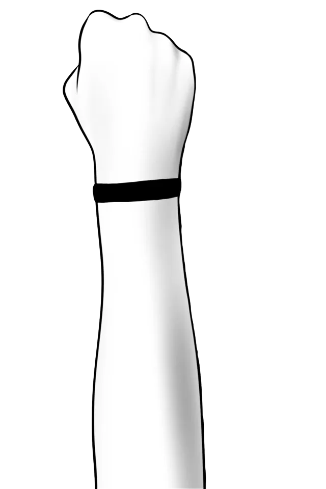
The wristband has motion sensors, a light, a vibration motor and a single button. The app keeps the sessions, the challenges, the teams and the progress over time.

We set its limits with people who know the sport: under 250 grams, so it never gets in the way of a shot, and built to take rain, dust and knocks on an outdoor court.

TURN YOUR HAND
The wristband does not try to guess whether a ball went in. After a basket you turn your hand, and the motion sensors record it. The wristband gives feedback with its light and a vibration.

The game goes on, and the score no longer depends on anyone’s memory.

A SESSION
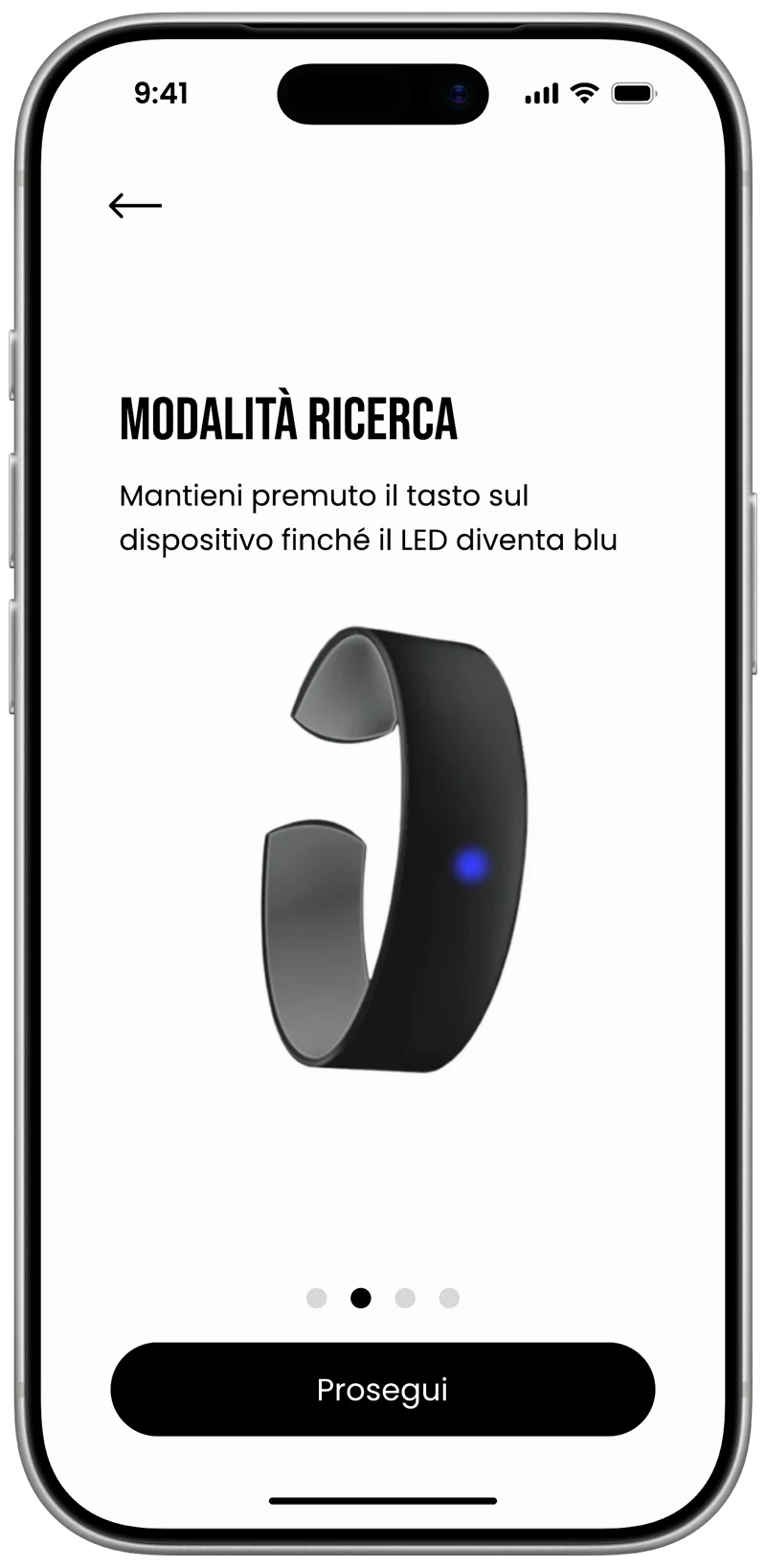
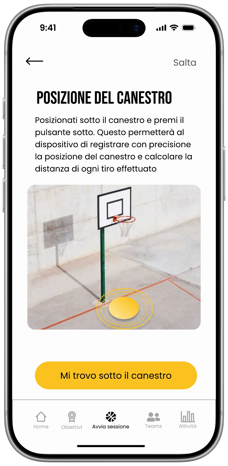
Pairing takes one button, held until the light turns blue. Before playing, you stand under the hoop and press it again, so the wristband knows where the basket is and can measure the distance of every shot.

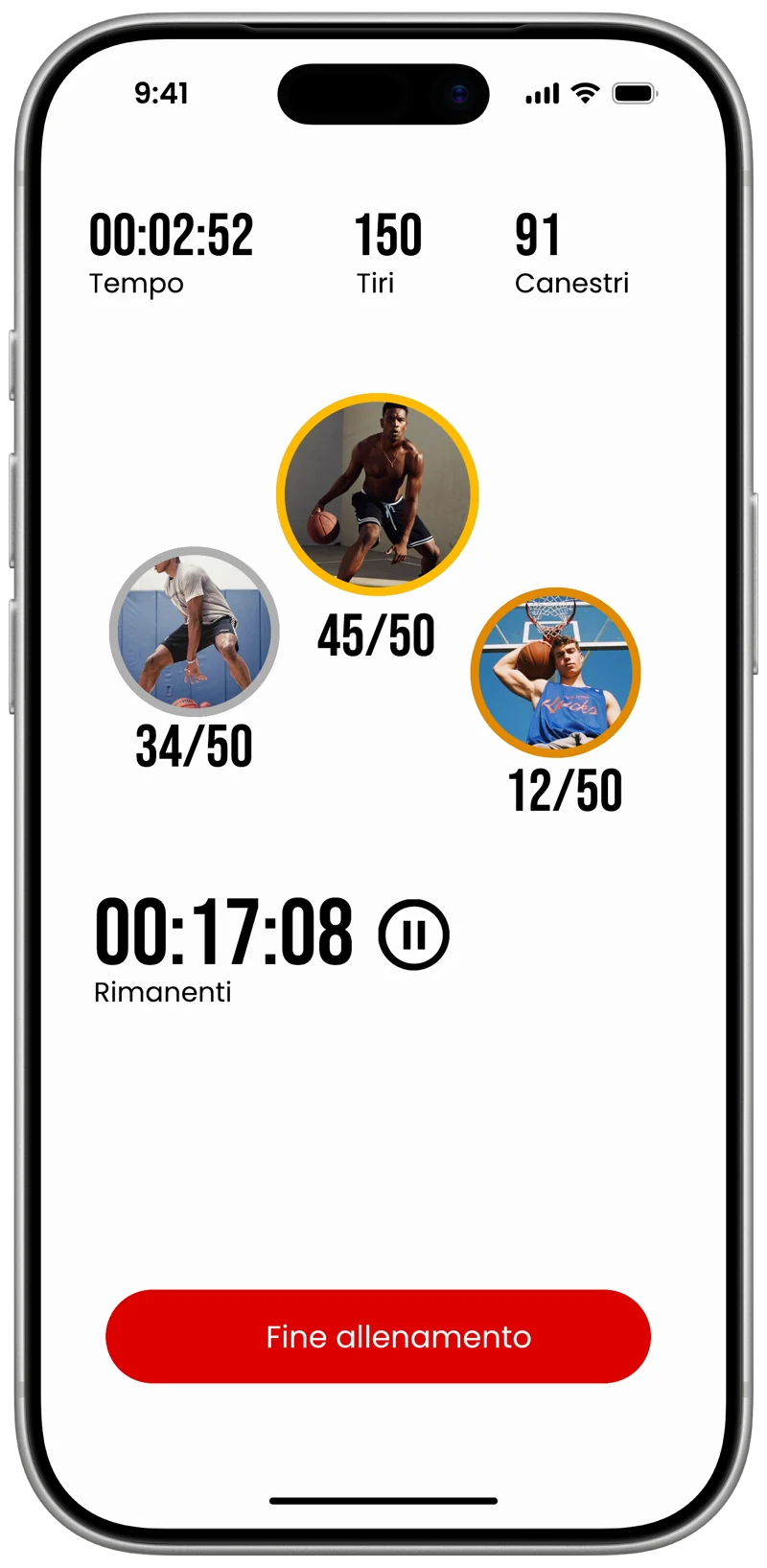
A session has a mode, such as free throws, long range or one on one, and friends join by email or with a code. While you play, the app shows the time left, the shots and each player’s score.

We mapped every screen in FigJam before drawing it in Figma, and checked each one against the parts of the screen the thumb reaches easily.

AFTER THE GAME
At the end the players stand on a podium, with the totals of the session and a note on shooting technique.

Because the wristband knows where the basket is, every shot has a distance. The session in our Figma file had 50 shots and 34 baskets, taken 6 meters from the basket on average.

Groups of friends become teams with their own rankings, and goals such as 100 baskets in a week give a reason to come back to the court.

WHERE IT STANDS
Flick ended with the presentation, with the app designed screen by screen and the wristband as a render. The decision I would defend again is the one at its center: one small gesture from the player is more reliable than a sensor trying to see the ball.
 1-pairing.webp
2-hoop-position.webp
3-live-session.webp
wristband.webp
readme.txt
inRange
An insulin pump app that says how you are doing.
UX/UI design, 2026

A redesign of the app that goes with an insulin pump, for people with type 1 diabetes. It answers one question first: how am I doing right now?

THE BRIEF
inRange was my final project for the Graphical interface design course at the University of Trento, in the 2025–2026 academic year. I worked on it alone.

The brief imagined a pump maker that wants to improve daily life for the people who already use its device: less friction, fewer people giving up, more trust in the therapy.

THE NEED
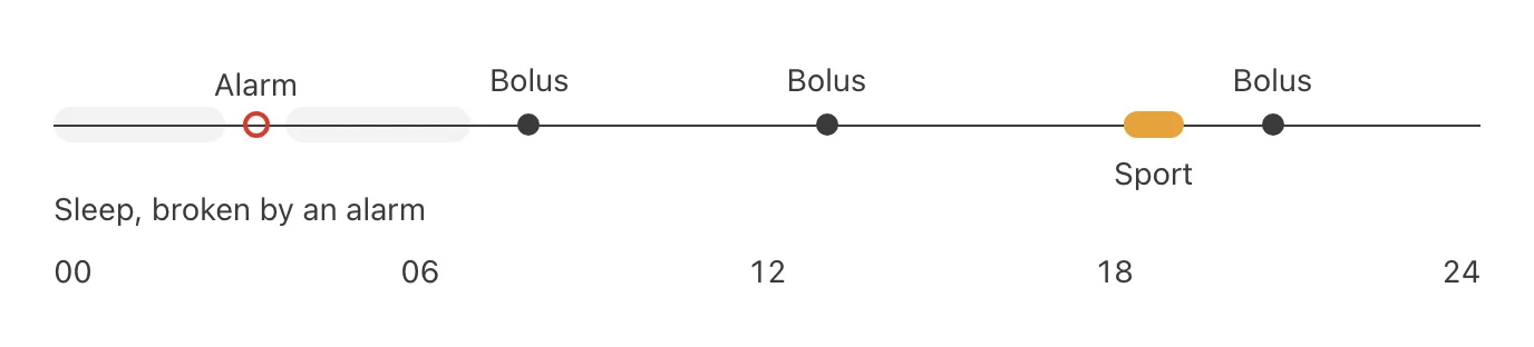
A person with type 1 diabetes on a pump wears it 24 hours a day, and the day is a chain of decisions. Before every meal they estimate the carbohydrates and give a bolus. During sport they change the basal rate or stop it. At night the pump can wake them with an alarm.

None of it stays the same for long. Food, exercise, stress, timing and even the weather move the glucose, so what worked yesterday may not work today.

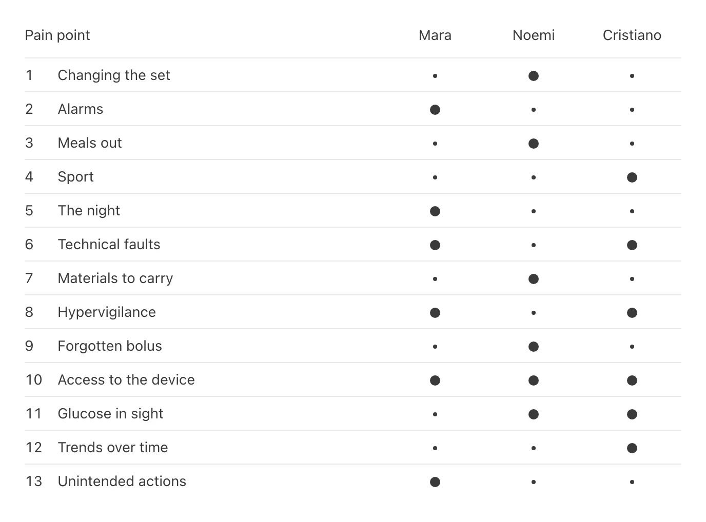
13 PAIN POINTS
I modeled the domain before drawing anything: the recurring activities, the states a day goes through, from routine to alarm to the low attention of the night, and the situations that strain it most, such as meals out, sport, water, technical faults and the set change.

That gave 13 pain points. Among them: alarms that sound in the wrong place, the fear of lows at night, a bolus forgotten before a meal, the fear of delivering insulin by mistake when tired, and never having the glucose in sight when it matters.

From them I built 3 personas, bottom up. Mara, 58, wants to feel in control at all times. Noemi, 20, lives in a rush and forgets things. Cristiano, 28, trains often and does not want to lose control while he does. They are not real people but attitudes, chosen to cover the night, the meals and the sport without overlapping.

WHAT I LEFT OUT
A step-by-step guide to changing the infusion set: after a few days it becomes routine. A daily checklist: days with diabetes are never standard, and an unticked list only blames. Advice on counting carbohydrates: food apps already do it, and it would move the focus from the pump to the plate.

The app also gives no clinical advice. It never calculates a dose and never decides the therapy on its own, and it is not a tool for the doctor.

STATE FIRST
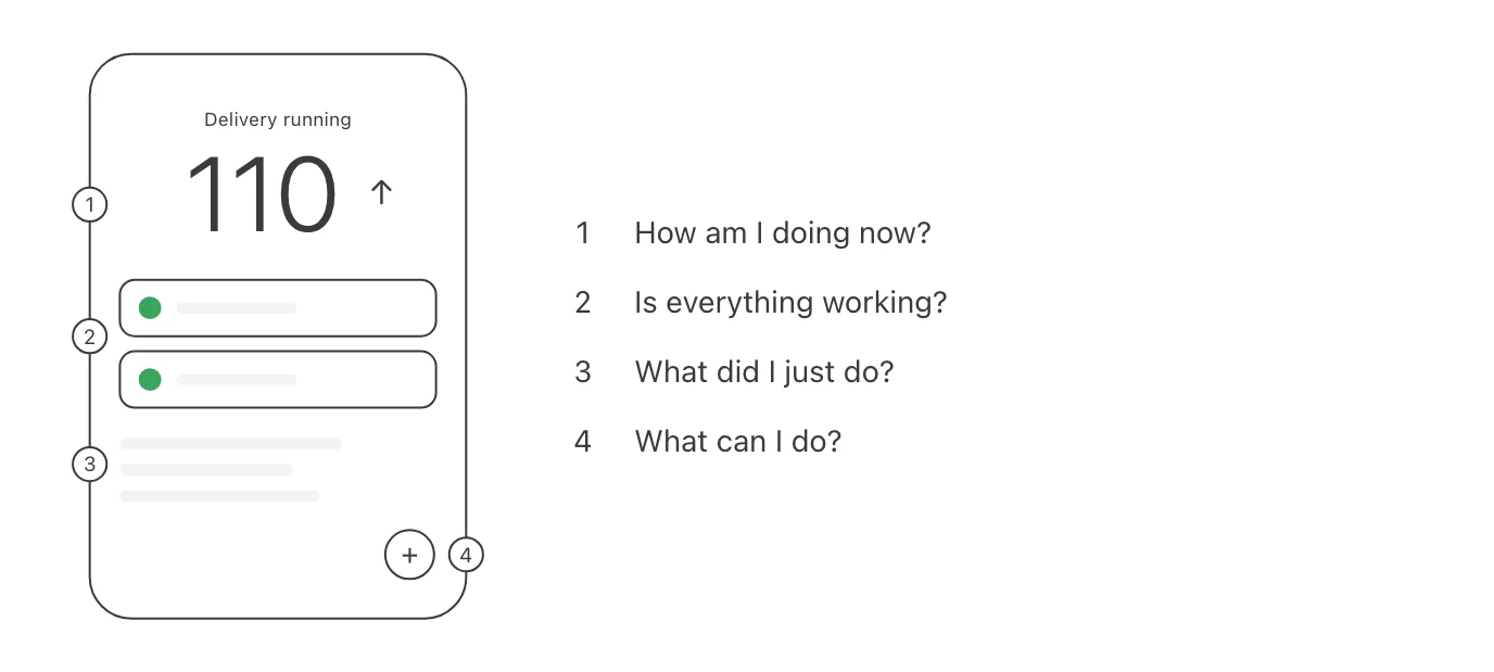
From the pain points came a few rules: clarity first, detail after; an alarm understood in a few seconds; few steps when it matters; and always knowing what is happening and what you just did.

So the home is a control panel. The glucose is the largest thing on the screen, with its trend. Below it, whether delivery is running, the pump and the sensor in 2 cards, and the last actions taken. A single button opens the actions: a bolus, sport mode, night mode.

3 MOMENTS
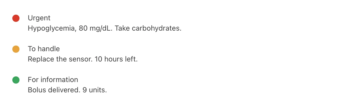
At night, Mara’s alarms say how serious they are before she opens anything: an icon, a color and one line. A low that needs action looks nothing like a sensor battery at half.

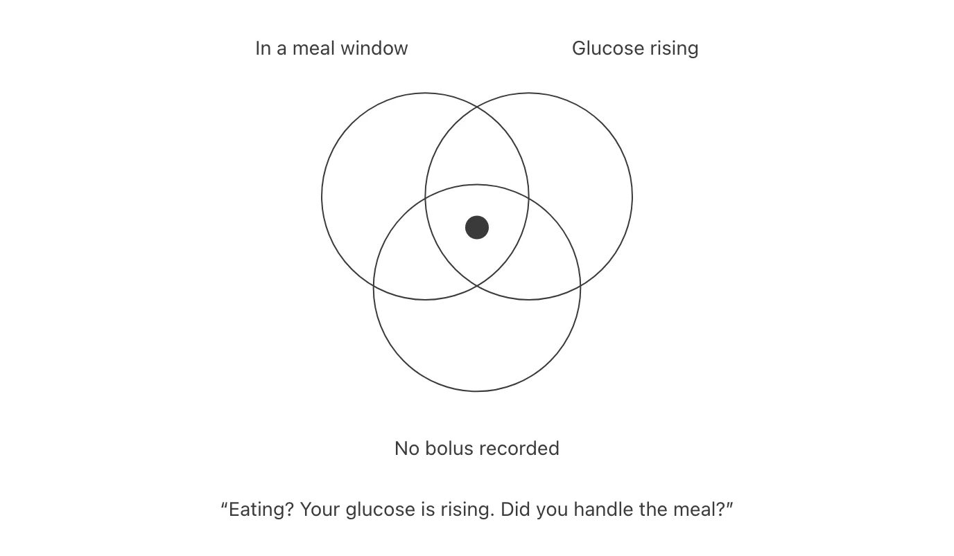
At lunch, Noemi picks a saved meal and the dose she used last time is already there. She can change it, and a dialog asks her to confirm before any insulin is delivered. If she forgets the bolus, a reminder comes only in her meal hours, and only if the glucose is rising with nothing recorded.

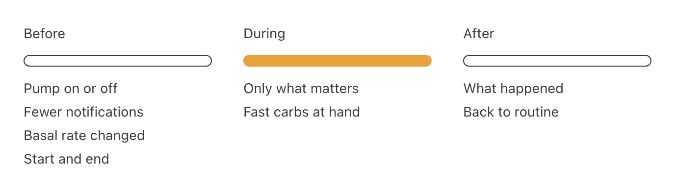
Before training, Cristiano sets sport mode: whether the pump stays on him, whether to quiet the notifications, a temporary change to the basal rate, and when it starts and ends. A note reminds him to keep fast carbohydrates at hand.

COLOR THAT MEANS SOMETHING
The interface is built on Material 3, with a palette of my own. Material’s colors are accessible, but they do not carry a medical meaning, and here color is not decoration. Green means the therapy is running as it should, yellow and orange a temporary change such as sport or night mode, and red a critical alarm.

I also sketched the essential numbers outside the app: a lock-screen widget, a watch face and a car display, for the moments when the phone cannot be opened.

WHERE IT STANDS
inRange ended as a report and a Figma prototype, one moment for each persona. What I keep from it is what I left out: in an app about insulin, every feature you add is one more thing to get wrong.
1-a-day.webp
2-pain-points.webp
3-home.webp
4-alarm-levels.webp
5-bolus-reminder.webp
6-sport-mode.webp
readme.txt
Known
The food diary you can trust.
Design and development, 2026 · App Store soon
https://tryknown.app

Known is a food diary for iPhone that tells you exactly what you eat. It starts from the values declared on the label, and it marks every number by how far you can trust it.

THE NEED
Known began with a need of my own. I have diabetes, so every day I have to count the carbs in what I eat, and I need the precise number, not a guess. Rough numbers and cluttered apps are not enough for that.

THE IDEA
Most packaged food already has that number printed on it. The brand declares it on the pack. So the idea was simple: a diary that starts from the label, estimates only when no declared value exists, and always tells you which is which.

It began with carbs, but people count different things: protein at the gym, calories on a diet. So the app counts everything, and you choose what leads.

THE DIARY
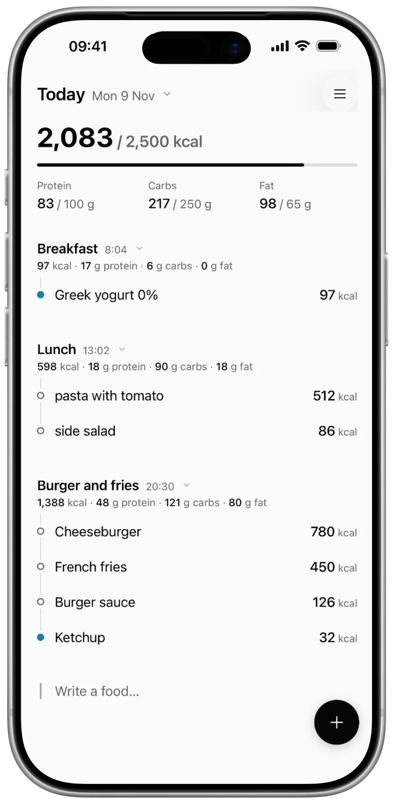
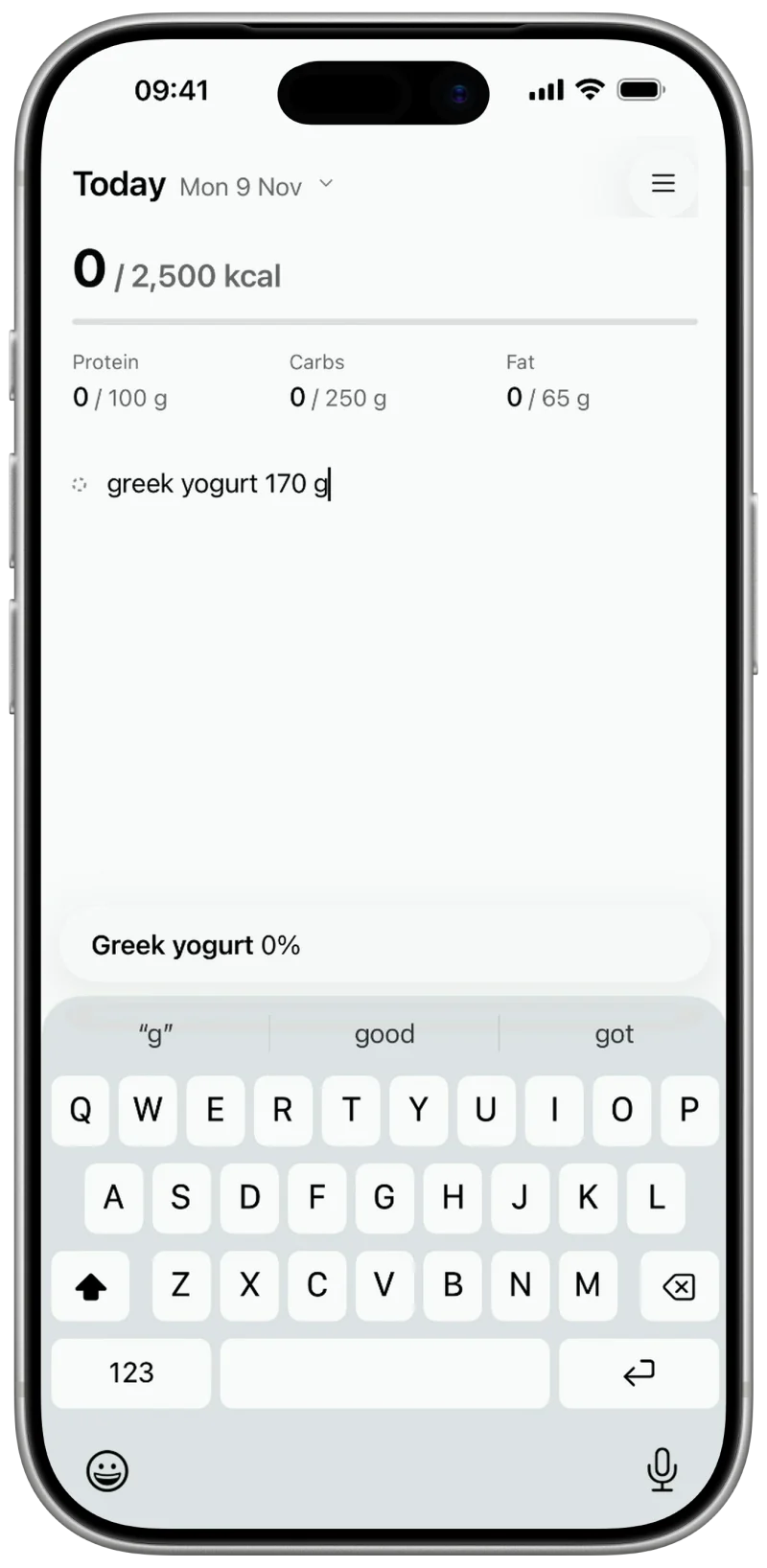
The main screen is one page for the day. At the top, the number against your goal and the 3 macros. Below, the meals in the order you ate them, each food with its mark beside it. At the bottom, a line that is always ready for the next food.

I kept out what does not help you log the next meal. There is no account, because the diary syncs through iCloud. There are no counters or leaderboards, and the voice stays calm: short sentences, facts, no exclamation marks, no guilt.

You open it many times a day, so on my iPhone it opens in under half a second.

3 MARKS
A number on a screen always looks certain, even when it is a guess. I wanted the diary to say where each value comes from, so that you always know what you are looking at.

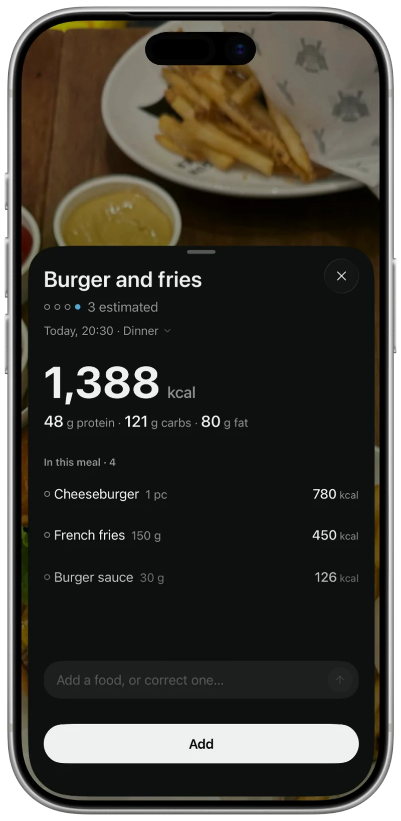
A full blue dot means the values come from the label. A half dot means they still have to be matched with the pack. An empty ring means no declared value exists, so the most advanced AI models estimate it. An estimate is still a strong number. The ring says how it was made, and nothing more.

VERIFIED TOGETHER
The critical point of food apps is often the catalog they rely on. An app can only be as exact as the data behind it, and product nutrition data is a private market, hard to reach and often out of date. A polished diary on a wrong number is still a wrong number.

That is why I built Known around one mission: verified together. Instead of trusting a database, Known asks people to check each food against the real pack, one by one, until every food is verified.

I started the catalog myself. I read the values from the producers’ own sites whenever possible, and I went to supermarkets to check the real values on the packs by hand. When you scan a barcode, Known looks there first.

Even a verified product can be wrong. The real pack is the only truth, so values and portions stay correctable on every product.

A half dot is a food still waiting for someone to check it. When you check it against its pack, it turns blue on your phone right away. The correction is reviewed, then added for everyone.

MANY WAYS IN
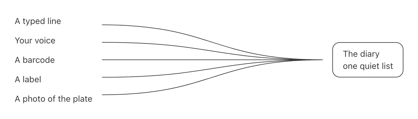
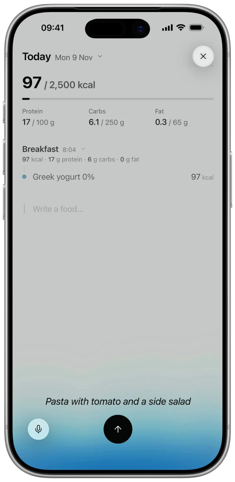
A diary only works if you keep writing in it, and a meal rarely happens at a desk. So the same meal can be typed in a line, said aloud, scanned from a barcode or a label, or photographed on the plate. Whichever way it comes in, it ends in the same quiet list.

WHERE IT STANDS
Known started with one number I needed to get right. It became a diary that says where every number comes from, and a catalog that people check together.

It is in its last steps before the App Store, and the launch is only the start of the mission: every food someone checks against its pack makes the next person’s number more exact.
1-the-diary.webp
2-three-marks.svg

3-many-ways-in.webp
4-typed.webp
5-said-aloud.webp
6-photographed.webp
readme.txt
Sip
A dehydration alarm silenced only by water.
Product and interaction design, 2024

An alarm clock that lives in a coaster. It stops only when you lift the glass of water standing on it.

THE BRIEF
Sip was a project for the Human–computer interaction course at the University of Trento, made with my team. The brief asked for an alarm clock that, besides waking you up, solves a health problem.

THE NEED
We chose dehydration. Many people wake up already short of water, and feel it as tiredness, poor concentration and cramps.

WHAT EXISTED
Hydration reminders already existed, like Ulla, which clips onto a bottle. We found none that tied drinking to the moment you wake up.

THE IDEA
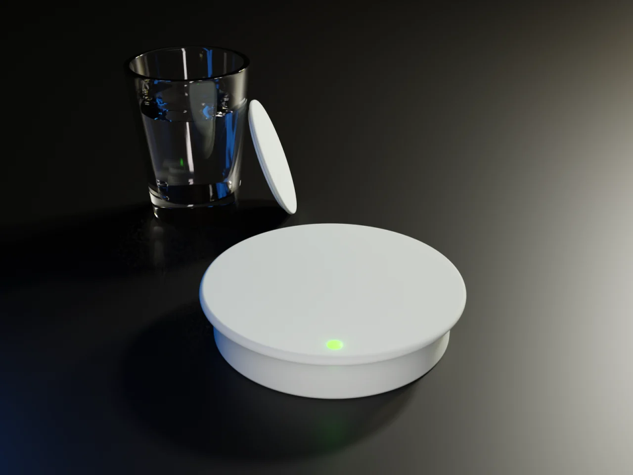
The alarm sits inside a coaster, with a glass of water on it. When it rings in the morning, the only way to stop it is to lift the glass, and a sensor inside the coaster notices.

The set is 3 pieces: the coaster with the alarm inside, a glass, and a cap that keeps the water clean through the night.

LIFT TO STOP
When the alarm rings, a white light comes on at the front of the coaster. It shows where the glass is in a dark room, without turning on another light.

Lifting the glass turns the light green and plays a short sound, so you know the alarm is off without looking for a button.

THE APP
The alarms are set from a companion app. We mapped every screen in a user flow first: signing in, pairing a coaster, the alarms of each coaster, and a new alarm with its time, days, coaster and ringtone. A coaster pairs when its button is held until the light turns blue.

WHERE IT STANDS
Sip stayed a concept, shown with renders and the app’s screens. What I keep from it is the move at its center: the gesture that silences the alarm is the habit itself, so the water is already in your hand.
coaster-glass-and-cap.webp

Sorry, this program is not supported on this machine.
Try again in 10 years.
Terminal — bash — 80x24
Desktop & Screen Saver
Aqua Blue
- Apple Images
- Solid Colors
Screen Savers
 Flying Toasters
Preview
Use random screen saver